
 One of the areas that must be addressed in event design is the emotion of color, says Dianne Devitt, author of “What Color is Your Event? The Industry Resource on How to Think and Plan Creatively.”
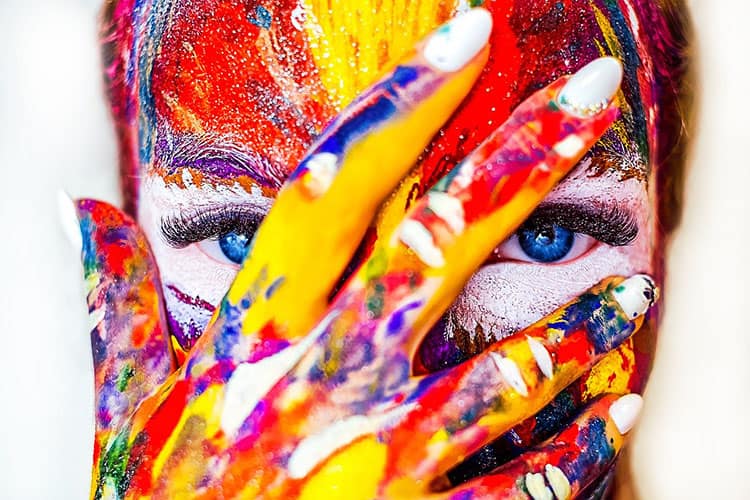
“Whether you recognize it or not, your event is using color to send powerful emotional signals to participants, minute by minute and second by second. Color choices are too important to be left to chance or whim, but all too often, that is exactly how they are made in design choices. The most talented and effective event designers know that colors can have a powerful affect on emotions,” explains Devitt about event design.
Think of color as a communication tool, not a personal preference, she says. Don’t make color choices impulsively; make them strategically. Show different color combinations to people and get their reactions: Which combination best supports the theme and message? Which conflicts with that message? With the venue? With the destination? Which combinations of colors evoke the emotions you want participants to feel?
If your budget is tight, you can use a robust, impossible-to-miss color choice everywhere to distract people from the details you can’t spend money on.
“As a yogi, we learn that each of the seven chakra points, or energy centers in our bodies, relate to a specific color like the rainbow. Beginning with red, orange, yellow, green, blue, indigo, violet, and ending at the top of our heads with white— purity. Each of these chakras is related to varying emotions, from grounding to courage, compassion, clarity, and focus. The designer of the future will incorporate this knowledge into planning to affect behavior and maintain harmony,” she explains.
The meeting and events professional must understand the intonations and meaning of color in different cultures. Failing to understand this means leaving yourself open to huge and unforgivable mistakes, like, for instance, using a color for celebration that represents death or insult within the society where your event is being held.
Whenever you are working in a culture that is unfamiliar to you, you must do your research and ask local experts to share their knowledge. What works in Indiana may not work in India; what works in India may not work in Indonesia. Individual color responses can come from cultural mores; reaction to color is based on those powerful learned responses as well as innate physical, mental, and involuntary emotional references.
Color is just one of the areas that must be fostered when planning successful and inspiring meetings and events. For other factors to keep in mind, download Devitt’s white paper, “Visual Dynamics & the Effect on Meeting Design,” by clicking here.
You Might Also Be Interested In
Kinetically Friendly Meeting Design


